 Manual home
Send Feedback
Manual home
Send Feedback
 Print
Print
|
|
|
|
|
QC abnormal results (graph)
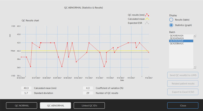
Display Statistics (graph):
All QC results from the chosen Starrsed Control batch are shown in a chart.
Shown in the graph:
- QC results (red) = values of measurements per date
- Calculated mean (yellow) = mean value of all QC results of the specific batch
- Expected ESR (green) = Assay mean value of chosen Starrsed Control
Shown as value:
- Calculated mean = mean value of all QC results of the specific batch
- Standard deviation = the average deviation of all QC results compared with the expected ESR
- Coefficient of variation (%) = ratio of the standard deviation to the expected ESR, expressed in a percentage
- Number of QC results
This graph gives a first indication of the measuring stability of the Interrliner. Further analysis and identification of systematic errors have to be performed in the user's Quality Control System.
Close
Return to History screen.
See Also |
Mechatronics home
Send Feedback
Print
|
Page last reviewed: 24/07/2018 13:44:35 (Version: 2.01 (04-05-2022) MRN-124_2-EN) ©2022 RR Mechatronics |